
Approaches to creating groups of colors that pleasantly agree with each other.

Color impressions from a novice coffee-drinker. A crash course in coffee and the surprising richness of its colors. First published in Solo Magazine issue 7.
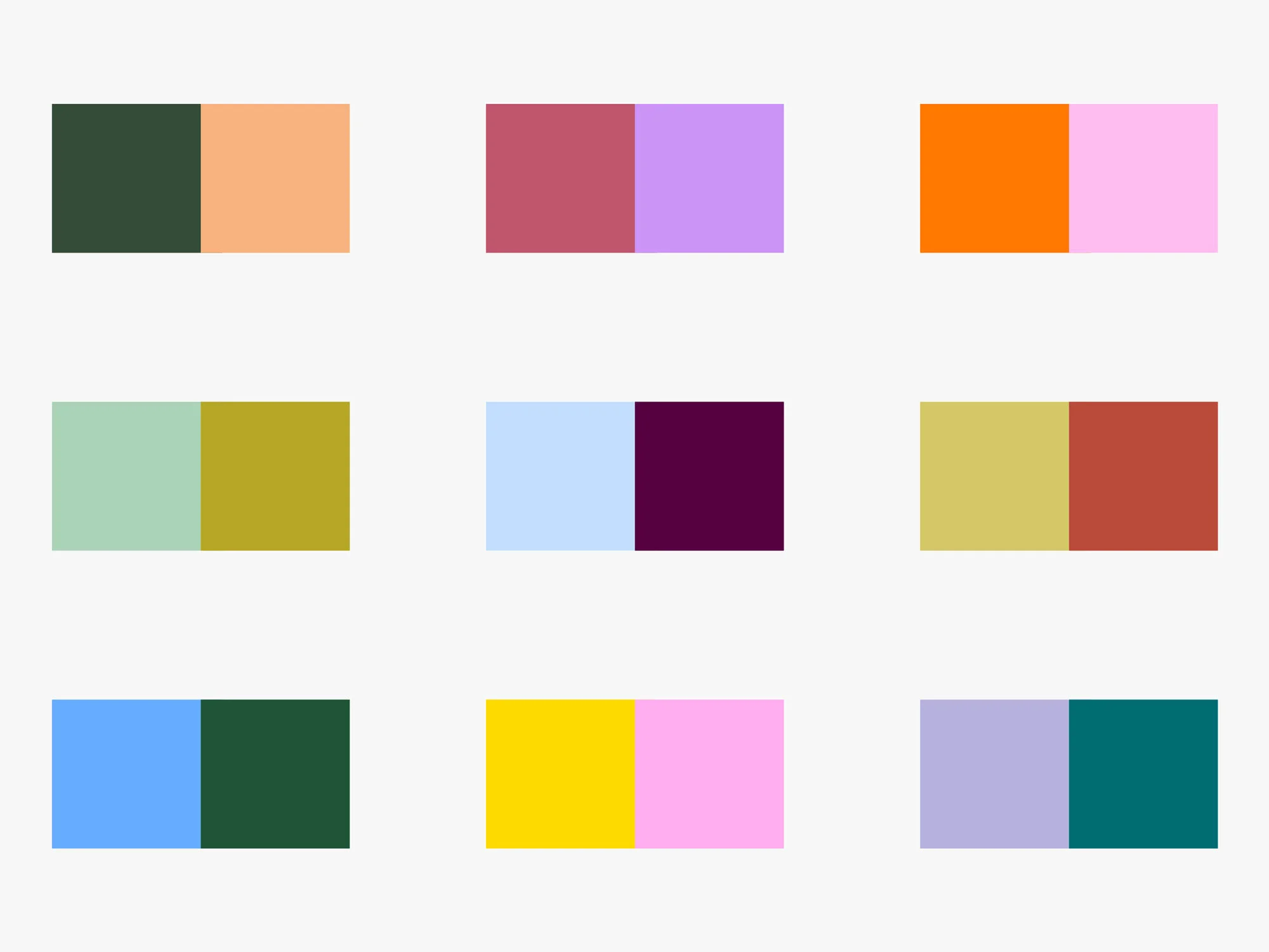
Particularities and possibilities of “halfway” color combinations, those found roughly at a right angle in the color wheel: red and purple, green and orange, purple and blue-green, etc.
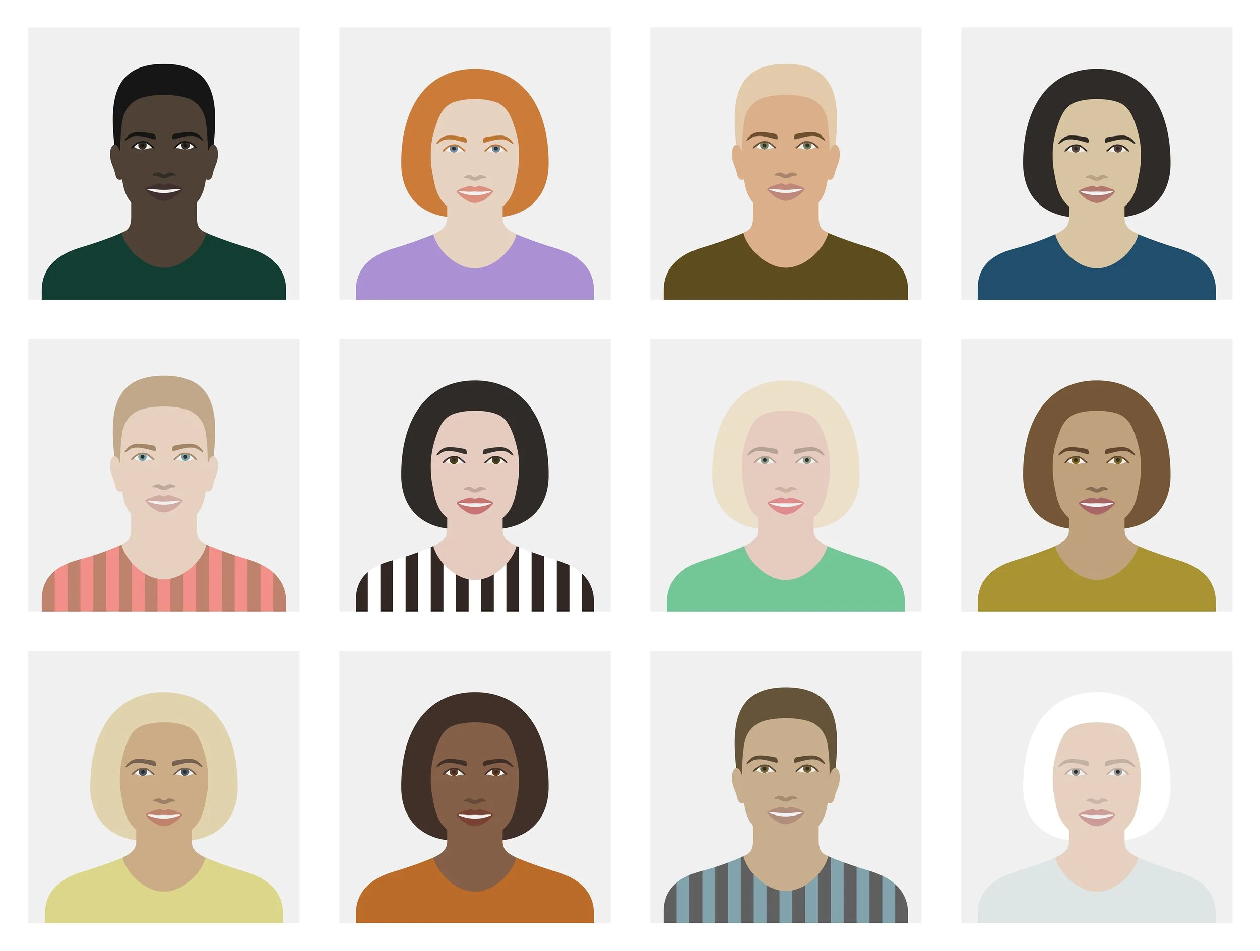
My attempt at explaining why only certain colors look good on us and how to get away with those that don’t.
PART 1: VALUE

My attempt at explaining why only certain colors look good on us and how to get away with those that don’t.
PART 2: INTENSITY

Hint: bold colors, shades and tints make good companions.

And why it is a joyful, positive colour combination. First published in Slanted Magazine #38 — Colours.
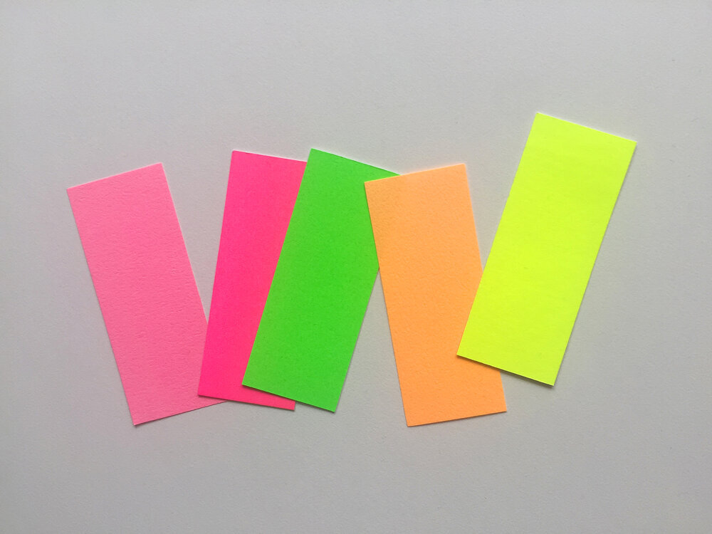
Writing about how to integrate fluorescent colors in palettes while avoiding excessive stimulation. Video version here.

Long-form article explaining how to combine colors more intentionally, based on the amount of stimulation they create.

How I learned to make color shine in a fuzzy context.

Sharing techniques for making handlettering more imperfect and expressive. Accompanied by examples —mostly of book covers. Published on Alphabettes.org.

Typeface review for the “Favorite Typefaces of 2019” published by Typographica.org.

Thesis developed within EINA’s master in typography, then updated and published on Typographica.org. The project consisted in an in-depth analysis of the independent digital type foundry industry in Europe, Americas, Australia and New Zealand.