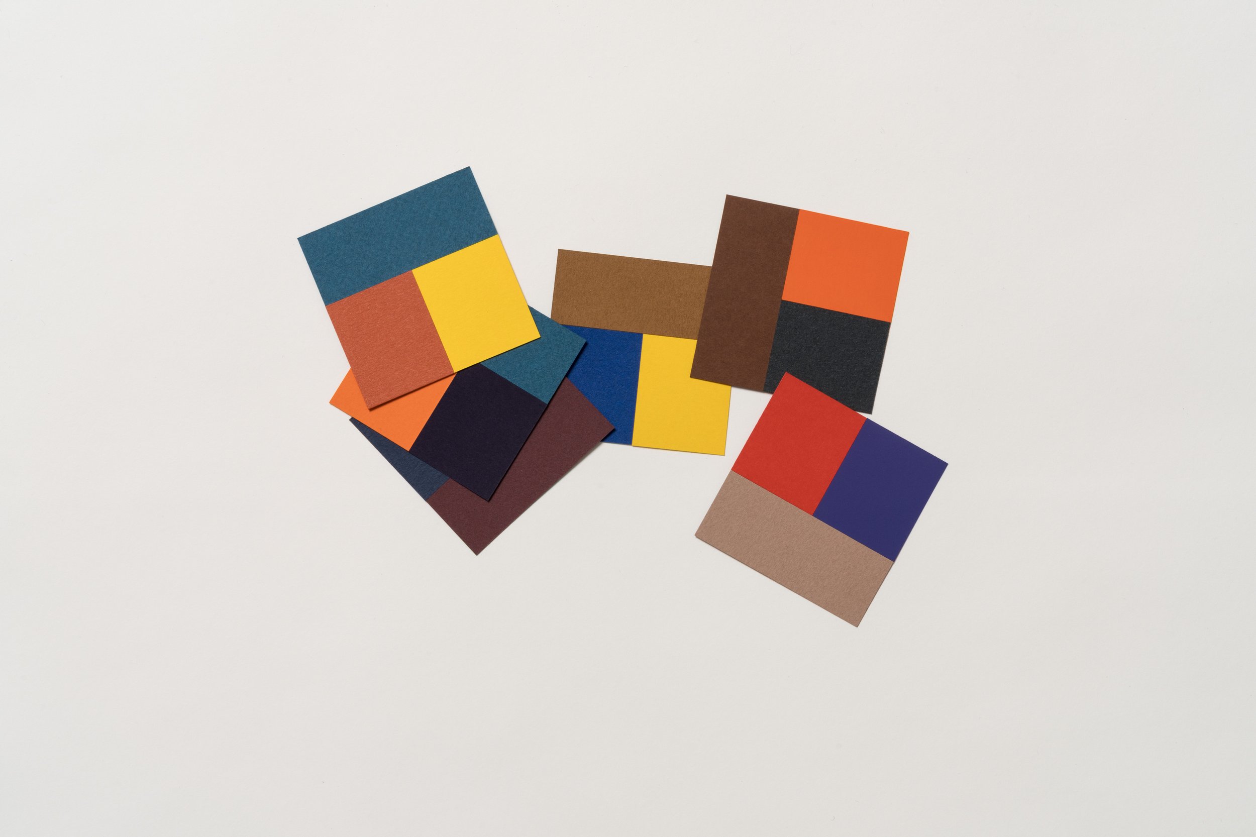
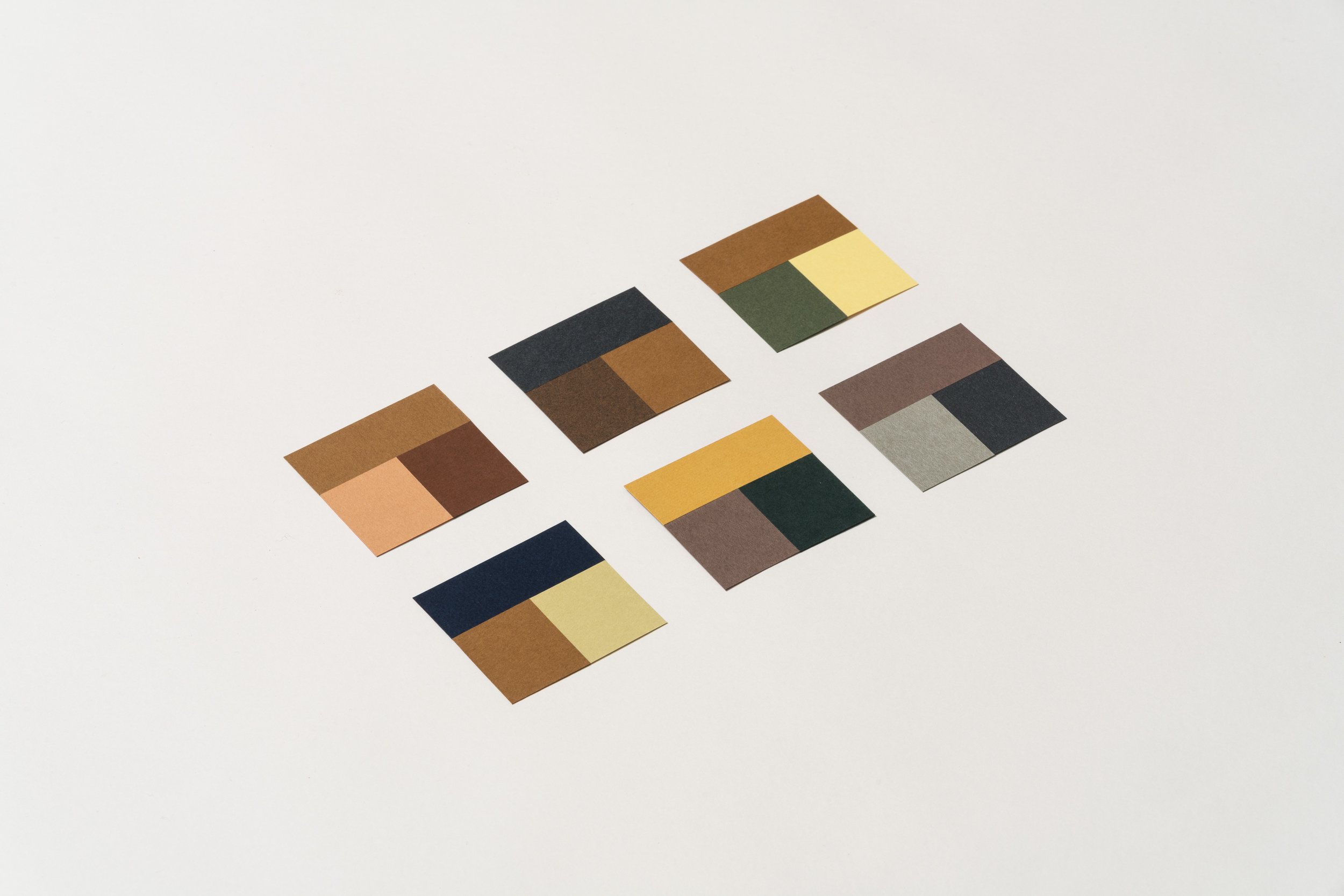
Three-color paper combinations
Personal library of three-color combinations, used as a tool to investigate color harmony and mood, as well as how colors are affected by each other. It is a natural continuation of the two-color combinations project.
These combinations specifically focus on colors in direct contact with each other, occupying optically similar areas. Compared to two-color combinations, the complexity of combining three colors increases, hence was something I wanted to explore.
These curated palettes also become part of a personal library that can be used as a starting point for other projects requiring color decisions.
Photography: Enric Badrinas